TheHome
Mag
A fast-paced print design role where every ad became a mini brand story crafted to grab attention and guide the eye in seconds.
Ad resize
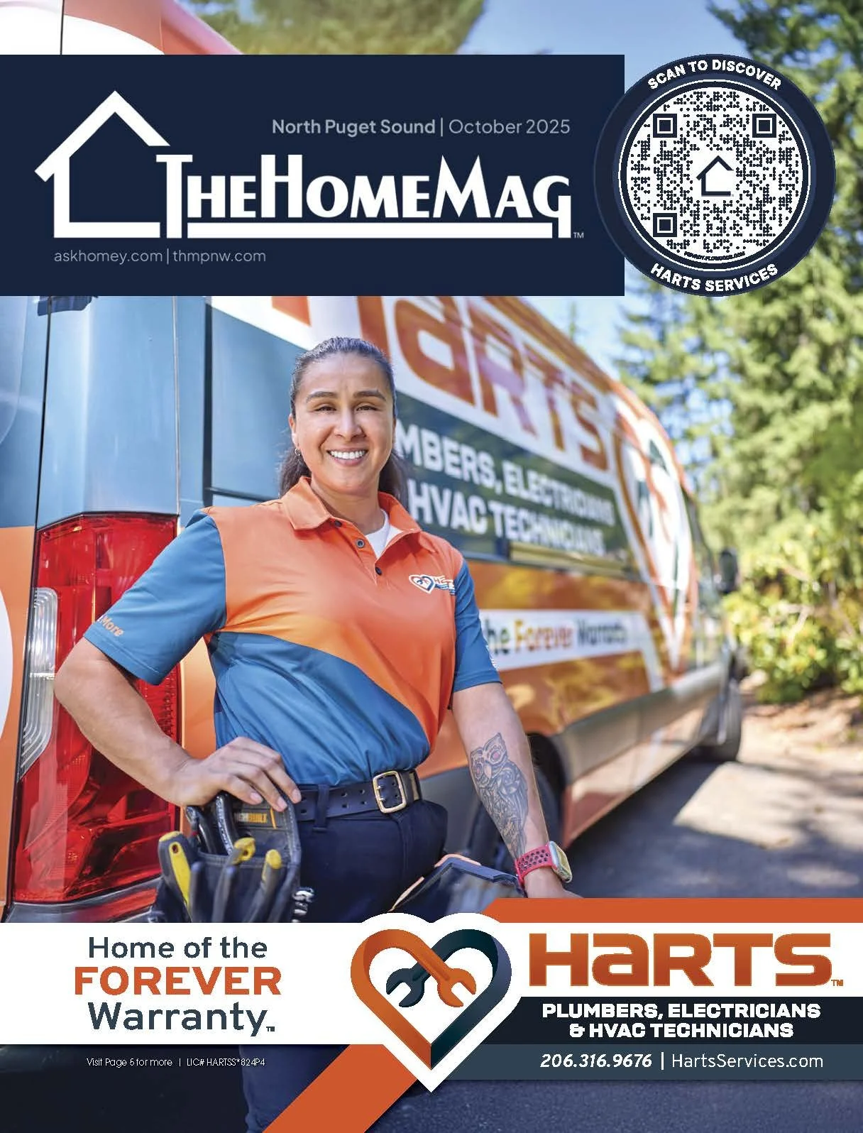
Magazine cover
Magazine spread
The Brand
TheHomeMag Pacific Northwest is a regional franchise of the nation’s leading home improvement magazine, dedicated to connecting top-tier homeowners with trusted local professionals. Each month, the publication delivers curated advertising directly into households across Oregon, Washington, and Idaho, showcasing high-quality craftsmanship and design expertise. The sales and design teams manages the full process—from ad creation and layout to printing and mailing—making it seamless for businesses to reach their ideal audience.
-
At TheHomeMag Pacific Northwest every page is a puzzle of typography, imagery, and color, designed to grab attention in the split second between flipping pages. Working in concert with the senior designer, we focused on turning straightforward ads into mini brand stories, using hierarchy, rhythm, and visual punch to make the spreads jump out.
-
Transformed client photos into aspirational visuals through targeted editing and tonal refinement
Resized ads across formats while preserving hierarchy, clarity, and brand identity
Redefined layouts to simplify messaging and enhance visual flow
Directed visual rhythm across multi-page issues to avoid ad clustering and maintain reader engagement
Handled prepress tasks including bleed/trim alignment and press-ready file delivery
-
My work helped elevate TheHomeMag’s visual standards, turning client-provided assets into polished, high-performing spreads. Through strategic layout, photo editing, and ad resizing, I supported monthly production cycles while reinforcing brand clarity and reader engagement across six 20+ page issues.
-
Adobe // Illustrator / Photoshop / InDesign
Apps // Magazine Manager / Gigapixel / Uniqode
// Coordination with printer
Photo Editing & Visual Refinement
At TheHomeMag, I transformed project photos taken by the client into polished, aspirational visuals. For one of the October 2025 covers, that meant balancing light, color, and skew so the remodel felt both true-to-life and inviting. Each edit elevated the space into a story homeowners could imagine themselves in.
Ad Resizing & Content Prioritization
Our clients often increased or decreased their ad sizes based on financial and seasonal cycles. This had to be done without losing clarity or impact. For Crown Patio Covers, I condensed a detailed full-page ad into a compact half-page, keeping the key offer, brand identity, and customization options intact. By adjusting hierarchy and flow, the downsized version still guides readers clearly.
Ad Redesign
& Visual Refresh
Redesigning ads means rethinking the space so the message is clear and engaging. In this example, I transformed a text-heavy half-page ad into a cleaner, modern layout with a brighter image, simplified headline, and streamlined service list. The result: a more approachable ad that highlights professionalism while making the offer instantly clear.
Layout Design & Prepress
As artwork production wrapped up every cycle, we turned our attention to layouts and printing. Working within our fast-paced, monthly cycle, I orchestrated the visual flow of multiple 20+ page catalogs. This included adapting inconsistent assets into polished product and problem solving artwork placement to ensure ads from the same industry weren’t in close proximity. Additionally I handled preflight checks, bleed/trim alignment, and uploading press-ready files to our printer.
Note: Our magazines incorporated in-house work, as well as client- and THM National-provided ads. Covers are always designed in-house.
Click the cover to view full magazine


